May
When The Client Fails
[responsivevoice_button voice=”UK English Female” buttontext=”Listen to Post”]
To many people, the biggest qualifier for good design is if it “looks good.”
The reality is that truly good design considers many factors: it’s strategic position in the marketplace, its reach of targeted audiences, how well it responds to new discoveries in technology, and how well it embraces contemporary written/audio/visual languages in an authentic way.
But what may be the hardest thing for designers to address when it comes to design: When the client failed.
”Sometimes we’re afraid to say what needs to be said during or after the design process, because we don’t want to lose clients or money.
When the company, event, or entity simply failed via corruption, fraud, or bad PR, designers tend to wash their hands of it, because we’re often not directly at fault for the failure. But, to some extent, we are. We cultivated the “face” of the company. We were with them when they succeeded. But when they failed?

Clients have to accept their failure on their own terms. But what is our responsibility to the stuff we made when the client fails?
Here are a few examples when designers did their best, but the client failed.
Enron
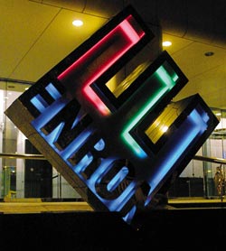
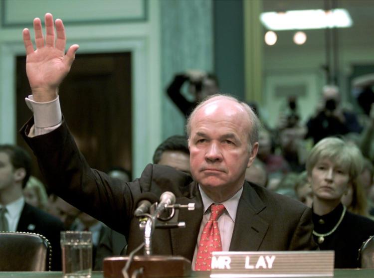
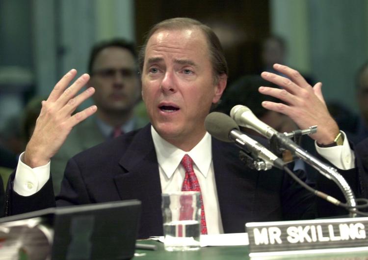
Enron was once one of the world’s largest energy companies. But by the turn of the century, they were involved in insider trading, deceptive accounting practices, and manipulation of California’s electricity supply.
The logo was famously designed by the legendary graphic designer Paul Rand (who passed away in 1996). In the years following Enron’s dealings, the logo for the failed energy company became synonymous with everything that is wrong with corporate greed: steely, unfeeling, and inhumane. Michael Bierut wrote an excellent essay on Rand’s logo and it’s association with Enron back in 2008. More on him later.
I was an undergrad during the scandal and was trying to learn the craft while developing my values. I wasn’t taught how to respond when something I may design becomes infamous. I had to learn the hard way how to make work that I was proud of, while still keeping my integrity intact.
The Lesson: You don’t always get to choose which clients you’ll work for. Develop an ethical compass around the companies you’ll wind up work for.
Uber
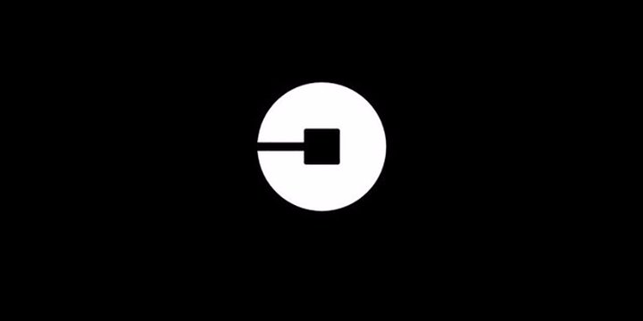
Last year, Uber redesigned their logo, and it was not well-met. I was one of the few people in support of the redesign. In the past year, however, it’s been modified to remove the teal color and pattern.
In that same period of time, Uber has been in freefall. From former employees’ claims of sexual harassment and toxic workplace culture to the #DeleteUber fiasco of January 2017, the state of Uber’s future is questionable.
These behaviors showed patterns within the company of short-sightedness and selfishness. But the logo redesign fallout was also at fault. As a backlash against the redesign grew, and few Uber drivers adopted the new logo on their vehicles, it was clear the communication on this redesign was inadequate.
The Lesson: If you’re in a tough situation, don’t double-down. Admit failure.
Fyre Festival
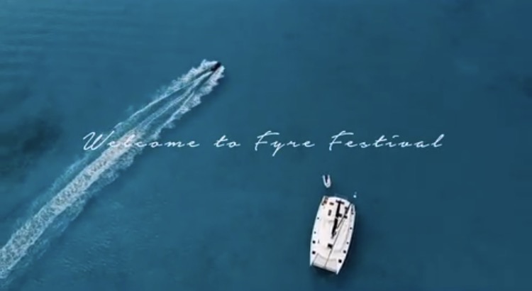
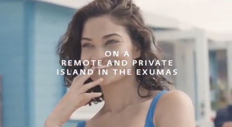
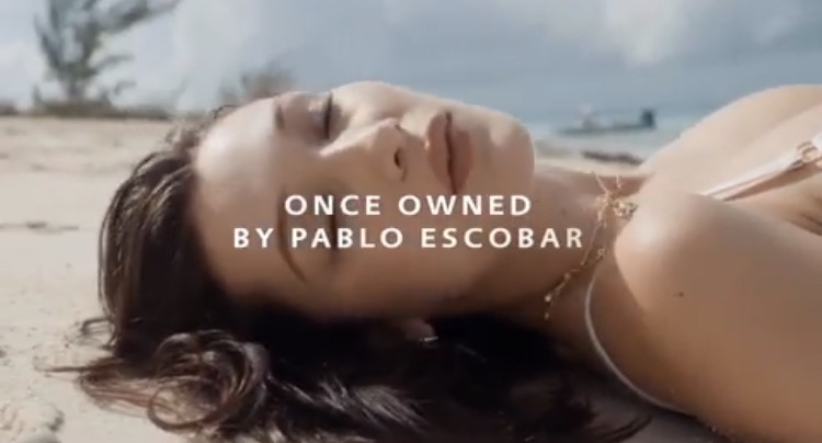
Fyre Festival operated on the strength of its marketing. Headed by a completely inexperienced entrepreneur Billy McFarland and a semi-forgotten rap impresario Ja Rule, for prices reportedly ranging from $4,500 to $250,000 the event promised a three-day music festival adventure on a private island in the Bahamas. (Lookup #FyreFestival on Twitter for the full schadenfreude.)
Instead, attendees were met with FEMA emergency tents, unlocked lockers for storage, unclaimed baggage, little to no food or water, and of course none of the promised entertainment.
I was following the story as it developed and did a little sleuthing. I wanted to find out who was responsible for the branding because they are the main “face” of what festival-goers believed to be true. MATTE Projects is a digital marketing agency that primarily works in the luxury market (Note: when the scandal unfolded, the agency removed Fyre Festival from their website.).
As the story unfolds daily, not only is MATTE Projects and 42West, the ad agency involved being sued for $5 million, the FBI is now investing into possible fraud.
The Lesson: Say no to inexperienced clients, no matter how much money they throw at you. It may cost your reputation in the long run.
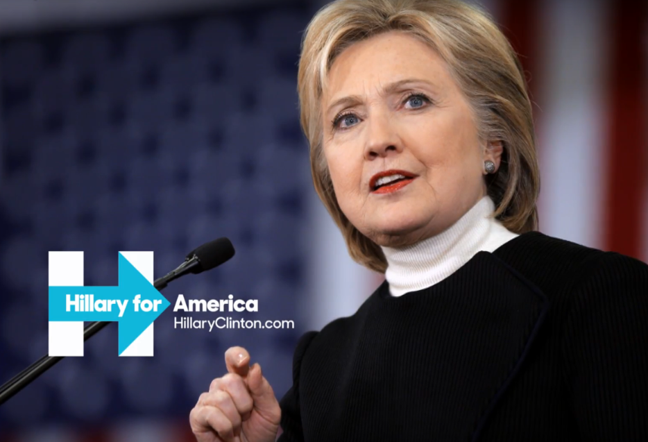
Hillary Clinton’s 2016 Presidential Campaign
Hillary’s second bid for president was successful in the primary but ultimately failed in the general election. She won the popular vote but lost the electoral votes needed to win the presidency. That instead, went to Donald J. Trump.
”Clients have to accept their failure on their own terms. But what is our responsibility to the stuff we made when the client fails?
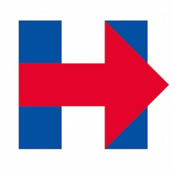
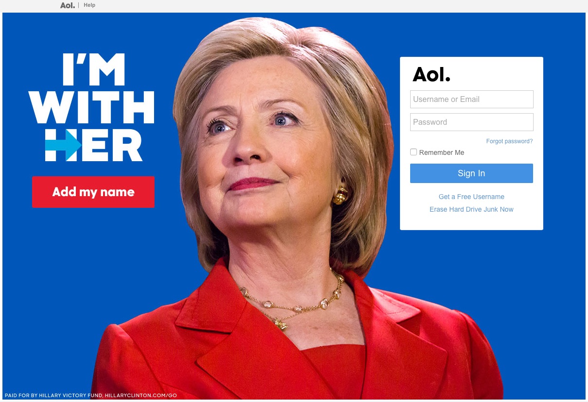
In the months leading up to and following the election, I came across quite a few design industry-related articles on the supposed success of the campaign branding. Imma keep it 100%. I could not understand why so much was written on the branding of a failed campaign. Sure, it looked good. The system made sense, intellectually. But Hillary Clinton lost.
Most recently, Michael Bierut admitted that as much as their goals were for achieving the perfect design system, it failed to reach the audiences they intended. I appreciate that consideration, as he is a highly-regarded ambassador for our industry.
The Lesson: Perfect design systems are nice. But solutions that are less than perfect might be best if they connect with voters.
We Can All Learn From Failure
I get that most designers don’t intend to associate with ethically-questionable clients. In all honesty, how much is Paul Rand really responsible for Kenneth Lay? Not much, but if his supporter’s response was to take no responsibility for how his iconic logo affected Enron’s perceptions — after millions of people were defrauded and lost their jobs and pensions — then they possess the same hubris as the corrupt leaders of the company.
”Mistakes allow us to learn, to ask ourselves what our values are. And what kinds of designers are we going to be in the future.
Sometimes we’re afraid to say what needs to be said during or after the design process, because we don’t want to lose clients or money. We don’t want to develop reputations for biting the hand that feeds us. Or it could be we’re too close to the project and can’t see how long we’ve been in the monkey cage. We can longer smell the shit.
Whether it was a corrupt energy supplier, a ride-sharing company in the midst of a crisis, a privileged party fantasy that swiftly turned a fiasco, or a failed presidential campaign bid, we as designers and brand strategists have to own some part of the failure. Mistakes allow us to learn, to ask ourselves what our values are. And what kinds of designers are we going to be in the future.


