Oct
Post-Racism Couldn’t Save O.J. and it Can’t Save Graphic Design
Over the summer I watched O.J.: Made in America. It was the middle of summer, and the 6-part 30 for 30 documentary series was finally streaming on Hulu. Everyone I knew told me to see it, and it is brilliantly haunting. As noted on Twitter:
The sad thing about #OJMadeInAmerica is that whilst OJ is central to it, it's actually really about America and American society
— Ross McGuinness (@rossmcguinness) July 24, 2016
No one is safe in this series. Not even the world of advertising.
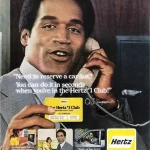
Episode 1 features a segment detailing how O.J. was courted by advertisers like Hertz at the height of the black power movement; a movement he avoided like the plague. At the time of the original airing, Advertising Age wrote a wonderful piece on that segment, so I won’t rehash it. Instead, check out one of the original ads of that time, and see if you can point out some the racialized intent:
As expertly pointed out in the documentary, O.J. benefitted from a desire for a marker of racial progress, without making it about his race. It was a kind of post-racial practice that advertisers continue to reconcile with. And I applaud AdAge for having the foresight to immediately address it.
But when it comes to the graphic design of the print ads?
I’d hope to hear from some of the leaders of my industry, but the silence is deafening.
We can point out the history of the typography. We can point to a specific ad agency/art director that created the style of print advertising. We can point out the type treatment and color use of the Hertz logo. But all the visual themes of class, gender, and race are left to social scientists, social activists, and cultural critics. And while a handful of us sprinkled throughout the word have been critical of the politics of design, it’s not part and parcel of our lexicon.
Why is this so hard for us? Why is it so difficult for graphic designers and art directors to see their part in a kind of post-racial mythology? I suspect it has a lot to do with our belief that graphic design is “universal,” outside the realm of race. In Katherine McCoy’s “Good Citizenship: Design as a Social and Political Force,”
Most of our colleagues never exercise their right to communicate on public issues or potentially controversial content. Remove our freedom of speech and graphic designers might never notice. We have trained a profession that feels political or social concerns are either extraneous to our work, or inappropriate.
As a college senior, I asked a group of mostly black design professionals if racism was a problem. The answers ranged from a very obtuse “No,” to something like, “Yes, but it’s what you make that counts.” As though speaking up about racism invited problems. I found this incredibly hard to take in. Ten years later, ask me if I’ve experienced racism in my industry. The answer is,
Yes. This country — this world — operates on a pervasive presumption of anti-blackness that is painful and inescapable. It operates in our trusted communications systems, and we don’t do a good enough job of calling that out.
And today is Tuesday.
There’s a layout presentation due on black teachers’ experiences in the classroom. I want to use warm colors, and express that being “of color” is okay. But I need to make sure we aren’t using the red, brown, yellow, and green from our color choices in a hokey way. I also need to make sure we’re using actual black teachers, and not stock photography. And I need to effectively communicate this to our production artist before I go on vacation.
”Why is it so difficult for graphic designers and art directors to see their part in a kind of post-racial mythology?
In Black in Design @MICA, I said that will always be black, and always privilege the work. But also get the right to be unapologetically black and intellectual.
Racism mainly shows it’s ass in our industry by all of us buying into this idea that as long as we make an excellent website, ad campaign, logo, or typeface we will be judged by the content of our character. The reality, as we know, is different.
We cannot out-design our way out of racism any more than O.J. tried to outrun or out-jump it.
The onus of the contemporary black designer is not to “free” us. If you don’t want to participate in the “liberation ethic” that black art often dictates, you don’t have to. I’m just not here for those who say they’re too busy to engage. We’re all busy.
The role of the contemporary black designer can be to make excellent work. And while doing so, we can interrogate the socio-political context that created our design rules. But do so in a way that makes us as complicit as every other working designer.


