Apr
From the Archives | Stand Up. Change Ohio.
[responsivevoice_button voice=”UK English Female” buttontext=”Listen to Post”]
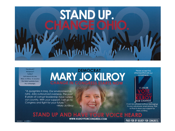
At the peak of the 2008 presidential election, I designed several direct mailers at Petel & Co., a firm that works with Congressional candidates. One of which was Mary Jo Kilroy (D-OH). The team wanted something modern, and connect to young college students at the Ohio State University. Included was a mobile sticker reminding voters of election day.
Earlier concepts used graffiti art and hand-drawn illustrations. None of those worked and did not understand both their audience and the candidate. By the time it got to me, there were few hours left in the workday. I turned this around rather quickly, drawing upon a few bold moves, relying on the typeface Century Gothic, and keeping the color palette tight.
It won Silver at the 2009 Pollie Awards, (pdf, p. 7) for Most Original/ Innovative Collateral Material under Mobile Device Tags.


