Feb
Diversity Without Pity #21 | Do The Right Thing
[responsivevoice_button voice=”UK English Female” buttontext=”Listen to Post”]
Paula Scher, at a panel discussion presenting We Made This and the OFFF Festival, said that we’re all influenced by the stuff we consumed as kids. I distinctly remember, at eight-years-old, my Dad telling me we were going to go see a movie, and the first time I saw a poster for a new Spike Lee “joint” in an issue of Ebony magazine.
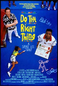
Art Sim’s iconic poster has been selected for permanent installation at the National Museum of African American History Art and Culture.
This poster immediately colored my imagination of what we were going to see, as I knew it would be something special. We weren’t seeing a “film” or a “movie.” No, we were seeing a “joint.”
My Dad took me to see Spike Lee’s Do The Right Thing at the Capitol Court Theater, which if you were black and grew up in Milwaukee in the 1980s, was one of two movie theaters on the north side of the city. What proceeded once we entered the theater was one of the first strong impressions of character, color, music, and drama, all applied to people who looked like my family, the neighborhood kids, and the corner store owners.
As an adult, my Dad purchased the Criterion version of Do The Right Thing on DVD, and he lovingly let me steal it from him (thx, Dad). This time, my imagination was colored by an unease this movie received at its debut and its legacy. At the time of its release riots, especially in New York City, were terrifyingly common. Detractors of Do The Right Thing, with its violent culmination seemed to suggest that rioting was acceptable, and this movie would encourage black people to be violent.
It’s very hard to scrub that kind of cynicism away when all I saw was a beautiful depiction of complex people. Granted, Spike Lee likes to go for high, near-theatrical drama. But when you’re an eight-year-old, there is no grey area for emotions. High drama is the only kind of drama worth acknowledging.
So I want to revisit this seminal film by highlighting the cinematography and production design, as it is the best way to describe to the adult version of me what the kid version of me loves about great design. Especially when it’s applied to black people.
”How do you express color? By heat. ~ Spike Lee
The special edition Criterion Collection DVD of Do The Right Thing features commentary from director Spike Lee, actor Joie Lee (and dope to hear Chuck D introduce each commentator separately), namely features cinematographer Ernest Dickerson and production designer Wynn Thomas. They offer the best insights on how the visual style of the movie is designed to tell the story of as Spike would call it, “a neighborhood on the hottest day of the year,” and about “man’s inability to get along.”

A carbon arc.
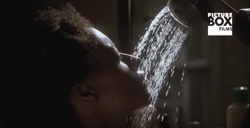
Dickerson offers fantastic behind-the-scenes production notes. Spike was a big fan of Hollywood musicals. For the opening title sequence, they wanted to create something hyper-real, but they had a small budget. Dickerson’s solution was to have a big translight backings, which are essentially giant slides. Then light those slides with different color schemes. One of Dickerson’s biggest inspirations was Jack Cardiff, one of the great cinematographers coming out of England. But more importantly it was the community and its geography. One thing he insisted on was that the block Do The Right Thing would be filmed be in a North-South direction. The sun would always be traveling from East to West. In another scene, neighborhood kids on the stoop, it was pouring rain. Dickerson managed to make it look hot. He was constantly challenged with coming up with a formula for making sunlight. To create the heat wave effect, he burned a couple of Sterno cans under the camera. Dutch angles reflect the tension between The Mayor and Mother Sister. He used carbon arcs, which are so old his gaffers needed training on how to use them. To make the “Can’t Stand It” sequence, they cut a hole out of a bucket, put a clear bucket inside that bucket, fill it with water and ice, shoot it from the bottom, actress Rosie Perez stuck her head in. Shot actress Joie Lee at high speed so we can really see the droplets coming down.
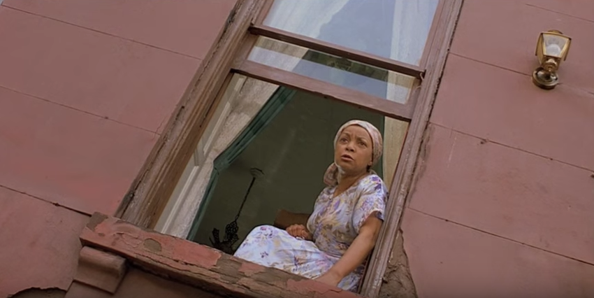
- Mother Sister, played by the late Ruby Dee, is shot up, in Dutch angle to make her appear superior.
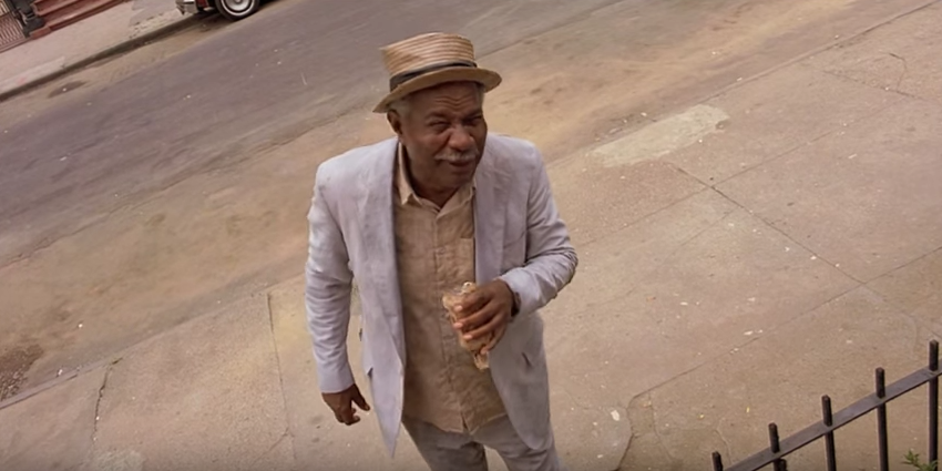
- The Mayor, played by the late Ossie Davis, is shot down, in Dutch angle to make him appear inferior..
- Actress Joie Lee was shot at high speed film to get the effect of feeling the droplets touch her skin.
But where Dickerson is the technician offering how-tos, Wynn Thomas is more the design philosopher. Thomas notes the challenge of keeping the audience visually stimulated throughout the 2-hour movie, given the movie takes place on one block.
Video: Wynn Thomas on color, line and texture in production design
There’s something a little stylized about most of the choices that were made…
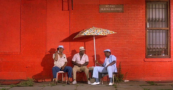
The film was taking place in an urban desert…Lots of reds, lots of browns. Deserts will also have these colorful flowers.
It’s hard to put politics into paint. The tool that I have as an art director is to create an environment where the issues can take place.
A lot of people think that because we are African Americans that we come to these films with the knowledge of everything that’s in these movies. So what that means is that people don’t think it’s necessarily designed. We’re not giving credit for the fact they are designed films. For the fact they are directed movies. This isn’t something that comes to us naturally. All the films are researched. All the films are very well thought out. So despite the fact we are African Americans we’re still interpreting the material…Because we are these people we’re not bringing our intellect and our talent. And we are.
”It's hard to put politics into paint. The tool that I have as an art director is to create an environment where the issues can take place. ~Wynn Thomas
The beauty of Spike Lee is that he loves black people enough to make sure we are not just well-lit, but lit beautifully. Not just that we have a nice set to walk on, but that we live in a lively, colorful world. That we express ourselves the best way we can imagine.
Diversity Without Pity is a blog series from IDSL, highlighting media that uses smart design, and considers the diversity of it’s casting without selling the viewer or consumer, short.


