Description
[responsivevoice_button voice=”UK English Female” buttontext=”Listen to This”]
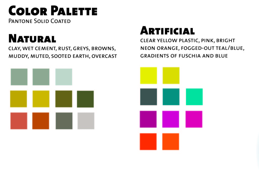
Blade Runner 2049 — a movie about a replicant who through a mysterious investigation, thinks he was born from another replicant — is bleak. Marketing for Blade Runner 2049 was portrayed as a kinetic, action sci-fi space opera like Star Wars. But the truth is, it’s the exact opposite. It’s deliberately slow-paced. There are bright spots of artificiality mixed with naturally dull decay and abandonment. And in that lays a quiet beauty.
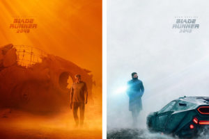
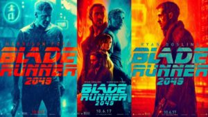
But the poster design is misleading and inconsistent. We don’t know if we’re going to see a meditative mystery or a kinetic space opera.
-

-
Official poster design for Blade Runner 2049
-

-
Official poster design for Blade Runner 2049
Blade Runner is a Slave Narrative! | The Moral Quandry of Poster Fan Art
I wanted to challenge myself with a poster redesign. To achieve two goals with my concepts (Use a color palette and visual rhythm more accurate to the movie, and create connections between newer and older versions of replicants), I used two different illustrative techniques to tie-in the movie’s theme of old replacing new. Figure drawings represent analog or old-school drawing. Vector shapes and blur effects represent newer-school digital illustration. But I had limitations. While I had the benefit of seeing the movie twice, I was limited to movie images found on the internet.

The following shows three variations, three in each series. They are named after key architectural spaces depicted in Blade Runner 2049.
Atari Series
Vegas Lights Series
Wallace Headquarters Series
Art Direction, Illustration, Design